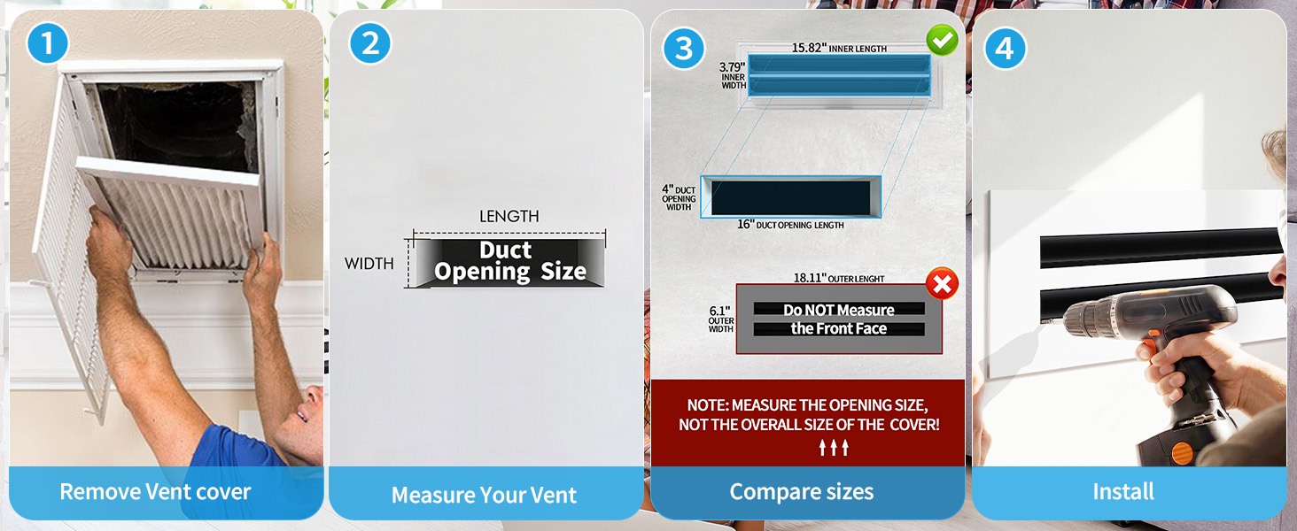
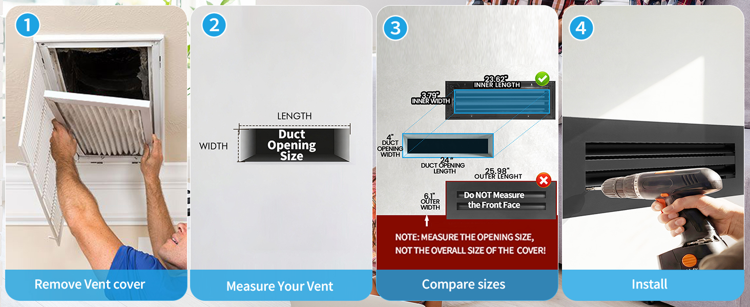
Buyer guide · Finish selection
White vs Black Vent Covers for Different Rooms
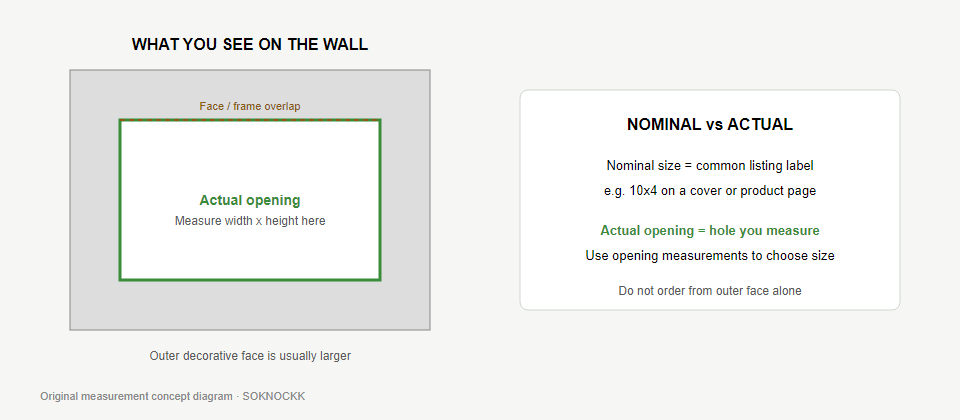
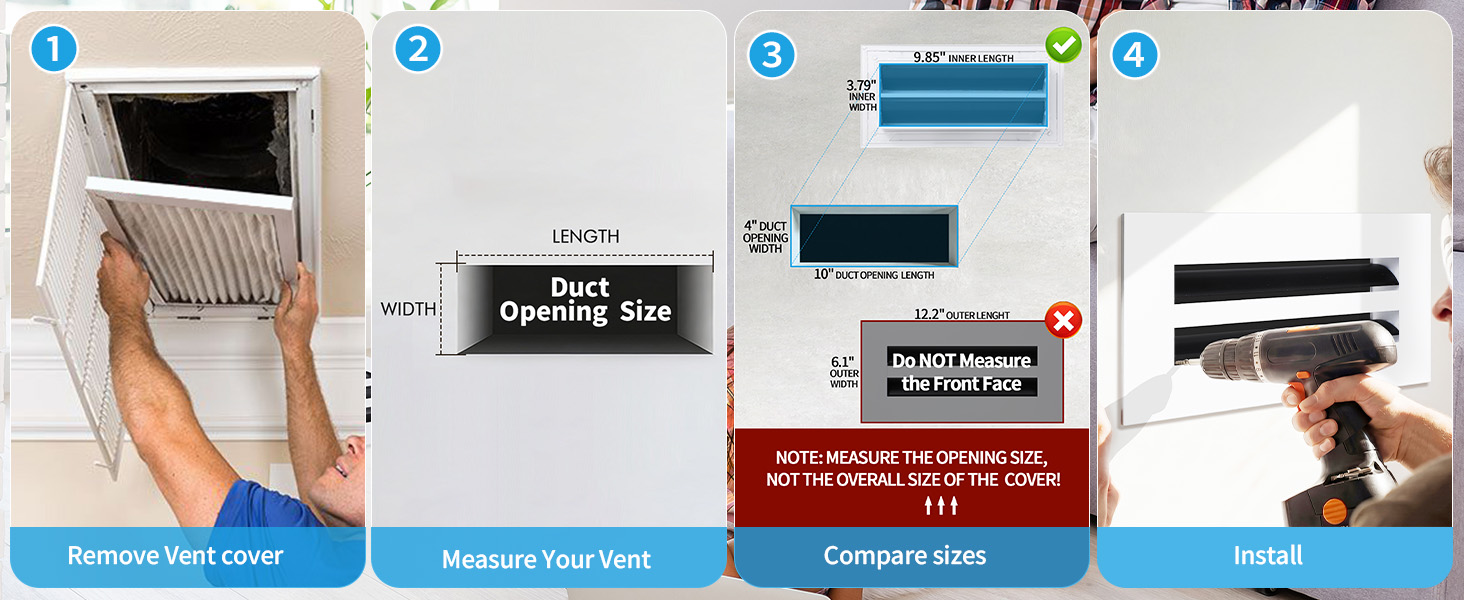
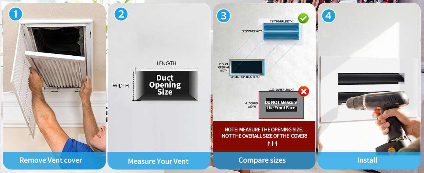
A vent cover is a small detail, but its finish can either settle into a room or become part of the design. Use the wall, ceiling, trim, nearby hardware, and how often the face needs wiping to decide where White or Black makes sense — after you confirm the opening size.
Quick Answer
Choose White when you want the cover to recede against a light wall or ceiling. Choose Black when you want the linear pattern to read as a deliberate accent or to relate to nearby dark details. You can use both finishes across one home if each room (or each continuous sightline) has a clear reason for its choice. Size comes first; finish comes second. Color does not change the opening measurement.
Compare White and Black from Confirmed catalog photos
These are verified SOKNOCKK product photos for Confirmed Size+Color pairs — not staged room installs, and not proof that every combination is in stock. Use them to judge finish contrast only after you know the measured opening size.
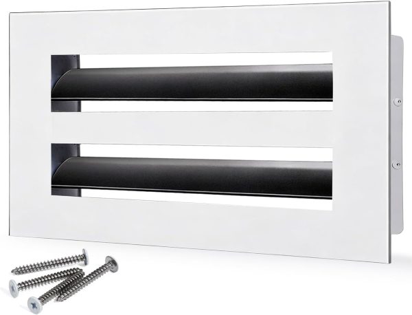
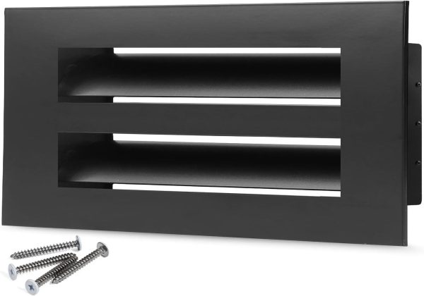
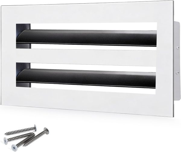
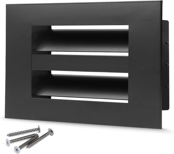
Catalog note: 6×4 is Confirmed in White only in the public Confirmed list used for this guide. Do not assume a matching Black option exists for every size; check the exact Size+Color on Vent Covers.
Start with surfaces, trim, and upkeep
Look at the vent from the place where you normally enter or use the room. A cover on a pale wall may nearly disappear in White, while Black creates a strong outline. On a dark painted surface, the visual effect can reverse. The same finish often looks more prominent on a ceiling than on a wall because there are fewer competing details overhead.
Next, notice the room’s repeated finishes. Black window frames, lighting, cabinet pulls, or furniture legs can make a Black cover feel connected. White trim, doors, and ceilings can give a White cover an equally clear relationship. You do not need every visible object to match — one or two repeated details are enough.
Also factor in maintenance. Kitchen and hallway covers near fingerprints or cooking residue show dust and smudges differently depending on contrast with the surrounding paint. That does not change product performance claims; it is simply a practical preference when choosing finish.
A room-by-room starting point
| Room or setting | Wall / ceiling cue | Consider White when… | Consider Black when… |
|---|---|---|---|
| Living room | Light wall; furniture and art dominate | The opening should stay quiet so seating and art lead. | Dark frames, lighting, or architectural lines already set an accent language. |
| Bedroom | Pale walls or light ceiling in the sightline from the bed | You want the cover to stay low-contrast for rest. | Dark trim or repeated dark fixtures already define the palette. |
| Kitchen | Near cabinetry, backsplash, or a frequently wiped face | The opening sits with white cabinets, trim, or a light backsplash. | Black hardware or fixtures already set a repeated rhythm nearby. |
| Hallway | Several openings share one corridor sightline | A low-contrast line of covers feels calmer on light paint. | Dark doors, rails, or lighting create a repeated accent down the corridor — keep one finish rule for covers seen together. |
| Home office | Opening in the primary desk sightline | You prefer the face to blend while you work. | You want the linear cover to echo dark shelving, frames, or desk details. |
These are design prompts, not rules and not room-fit certifications. A White cover can read as a crisp accent on a darker surface, and Black can sit quietly among other dark elements. Judge the actual opening and its surroundings.
Can you mix White and Black in one home?
Yes — when the mix follows a visible plan. Separate rooms can follow their own palettes when a doorway or other clear boundary breaks the view. For covers that appear in the same continuous sightline (open-plan living, a long hall, a shared ceiling run), apply one finish rule for that group so the line does not look accidental.
This is finish planning advice only. It does not replace measuring each opening, and it does not claim every White/Black size pair exists. For the size-vs-color rule itself, see White and Black — does color change the opening size? and the worksheet approach on Choose size and color independently.
Compare the finishes in the real sightline
Before settling on a finish, photograph the opening in ordinary daylight and again under the room’s evening lighting. Look at the photo from across the room. Ask whether your eye goes to the vent first, and whether that is the effect you want. This is especially useful for a ceiling opening, an opening beside artwork, or a line of covers visible together in a hallway.
Keep the cover’s linear design in mind: high contrast makes its shape more noticeable; low contrast lets the wall or ceiling read as a continuous surface. Neither effect is inherently better.
Make a whole-home finish plan
Choose a simple rule for connected spaces — for example, White on light ceilings and Black in rooms with black architectural accents. Open-plan areas usually look more settled when visible covers follow one finish rule. Separate rooms can follow their own palettes when the sightline is broken.
Record room name, measured opening (W×H), matching catalog size, preferred color, and quantity before you shop. That worksheet habit prevents a hallway or shared wall from ending up with an accidental mix. A printable pairing sheet belongs on the size-and-color resource page rather than as a separate URL.
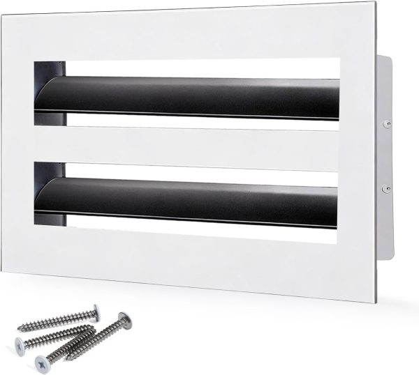
Related Confirmed products
Browse these Confirmed examples only after your opening size matches. Links go to public product pages; images are catalog photography already used on SOKNOCKK.
Next steps and a natural inquiry path
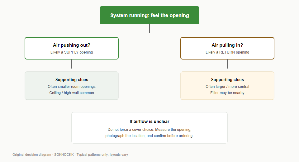
Finish selection does not establish fit. Record each opening measurement, confirm the matching catalog size, then select White or Black only if that exact Size+Color is Confirmed. Start with how to choose the right vent cover size, then browse vent covers.
If you are matching several openings across rooms and want a second pair of eyes on Size+Color choices from photos of your openings, use the contact path on the site after you have measurements ready — send room names, measured W×H, and which finish you are considering. Do not treat any table or example row as a stock or shipping promise.